

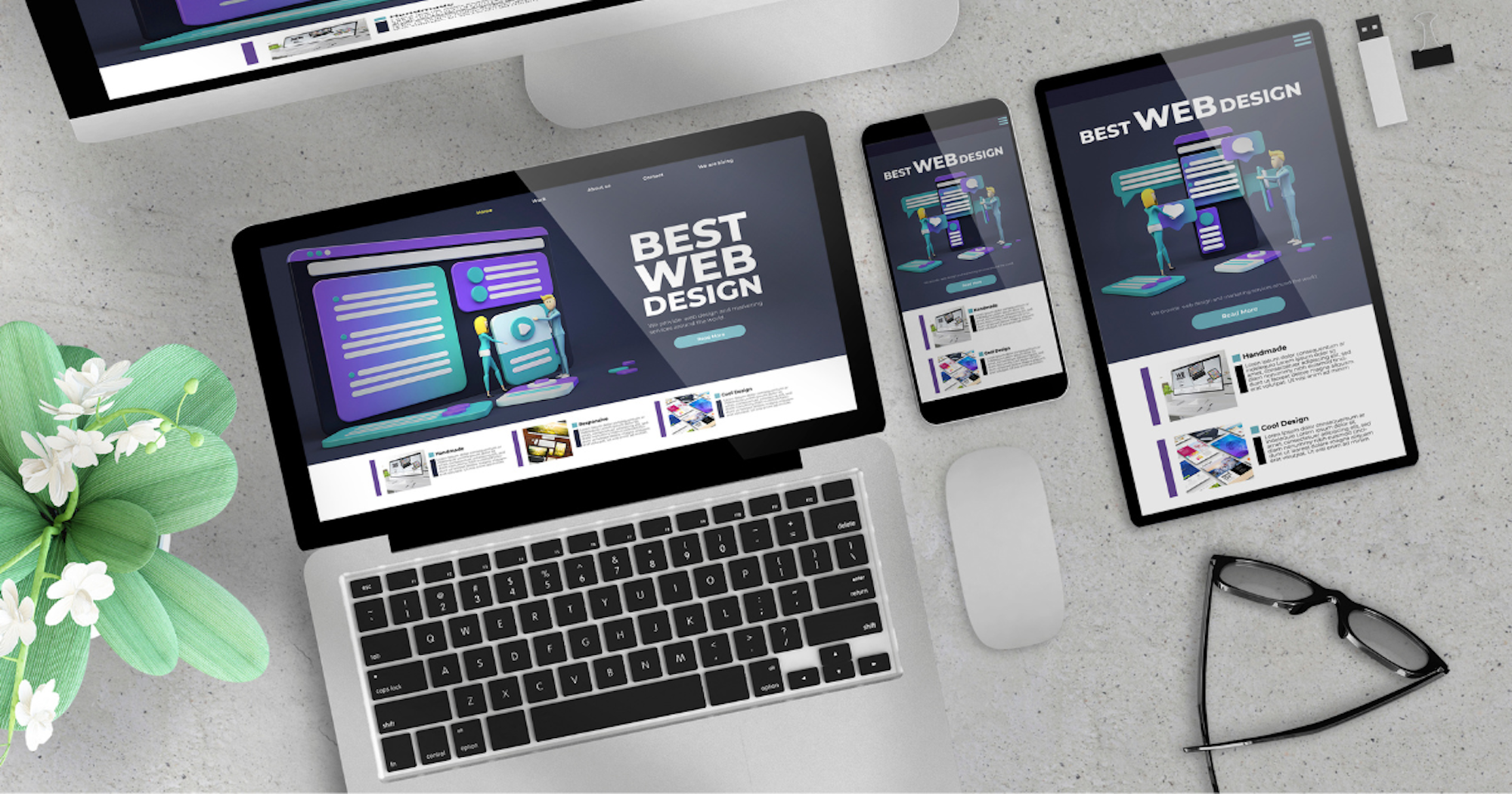
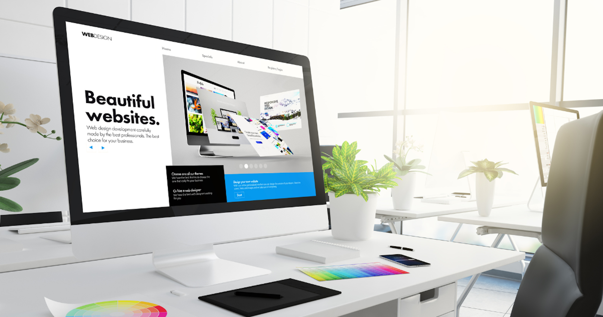
Open a dozen websites and the odds are you will start seeing the same patterns: the same fonts, the same layouts, the same soulless stock photos. It is not your imagination. Modern web design has become a sea of sameness.
While these cookie-cutter templates might be ‘safe’, they are also forgettable.
Looking like everyone else can dilute your brand, weaken your message and make it harder to stand out.
So why is this happening? And more importantly, how do you break free from the generic and create a site that actually feels like you?
In this blog, we will explore the most common design traps and give you practical ways to elevate your site. Whether you are starting from scratch or just overdue a refresh, this guide will help you design with intention.
Why so many websites look the same
Have you ever felt that one website looks just like another? You are not imagining it. In fact, science backs you up. A study analysing 10,000 websites found that web design has become increasingly more uniform over time.
They found that variations in colour usage and layout have declined since 2016.
This trend is largely driven by the widespread use of design frameworks and the prioritisation of user experience which often favours familiar layouts.
Companies also tend to imitate successful competitors, reinforcing the cycle of visual sameness across the web.
The hidden cost of a generic website
A generic website can make your brand forgettable. When your site looks like everyone else’s, it becomes harder to stand out, build trust or leave a lasting impression on visitors.
Worse still, many users may subconsciously associate the lack of uniqueness with a lack of quality or innovation. In a crowded digital landscape, blending in too much can mean being overlooked entirely.
Common web design pitfalls and how to fix them
There are some obvious, and easily fixable, pitfalls that many people use in web design that make your website look exactly like everyone else’s. Here are the top four:
1. Overused fonts: Same typeface, same story
Using the same fonts as everyone else (Roboto, Open Sans) makes your site feel generic and uninspired.
This can be fixed by choosing a distinctive yet readable font that reflects your brand’s personality. Pair fonts thoughtfully to create hierarchy and interest.
Cookie-cutter layouts are killing your uniqueness
Relying too heavily on standard templates can make your site feel indistinguishable from thousands of others.
The full-screen hero image, followed by three columns, then a testimonials strip, sounds familiar?
Don’t be lazy, rethink your layout. Experiment with asymmetry, unexpected section breaks, or interactive elements to create a unique experience.
3. Walls of text drive visitors away
Long, unbroken paragraphs can overwhelm visitors and cause them to bounce before engaging with your content.
Make your content skimmable:
- Use bullet points and numbered lists
- Break up text with subheadings
- Add pull quotes or highlight key stats
4. Lack of visual interest = lost attention
A bland, overly minimalist site might look clean, but it can also come across as dull and forgettable.
Relying solely on stock images or generic icons also won’t cut it.
Use custom illustrations, branded photography, or even subtle animations to add personality.

Standout strategies to elevate your web design
To help you create a more impactful and engaging online presence, explore these standout strategies designed to elevate your web design and enhance user experience.
Micro interactions: The subtle secret to better UX
Small, purposeful animations, like a button changing colour, can guide users intuitively and make your site feel more polished and responsive.
Make your CTAs work harder
Your calls to action should be clear, compelling and creatively worded. Go beyond ‘Learn More’ or ‘Click Here’. Use language that speaks directly to your audience’s motivations.
Brand cohesion goes beyond your logo
Consistent colour palettes, tone of voice and imagery build trust and recognition. Every design element should reflect your brand’s identity, not just your logo in the corner.
Accessibility and speed are competitive advantages
A fast, inclusive website is not just ethical. Ensuring your site loads quickly and works for everyone improves SEO, reduces bounce rates and broadens your reach.
Tell a story, don’t just sell
Users connect with narratives. Introduce sections that tell your brand story visually. Sections such as timelines, founder quotes, or customer journeys can all add depth and authenticity.
Make it interactive, not just informative
Quizzes, calculators, sliders, hover effects and personalised elements invite engagement. The more users interact, the more likely they are to remember, and return, to your site.
Add the human element
Show the faces behind the brand, share customer stories or include authentic imagery. People relate to people, not stock photos and corporate speak.
How to ditch the generic and design with purpose
Standing out online is not just about louder colours or flashier animations. It is about intentional, thoughtful design that reflects who you are and what your audience truly needs.
By moving beyond templates and trends, and focusing on clarity, connection and authenticity, your website can become more than just a digital brochure. It becomes a meaningful extension of your brand.
At Bigger Picture, we believe your website should be as unique as your brand. Our Hampshire-based web design team help businesses break free from cookie-cutter templates to create digital experiences that are bold, authentic and built with purpose.
From custom layouts to personalised interactions, we design with intention, so your website doesn’t just look good, it stands out and connects.
Ready to create a website that stands out? Get in touch with us today.