In short, your product pages are crucial when it comes to converting customers.
To make this crystal clear, think of the following scenario.
You have a product in mind, you’re searching online with intent to purchase. You land on your first site, navigate to your desired product with ease and you’re faced with a number of high-quality product images from various angles, great reviews/ratings and a description that tells you everything you want to hear.
Then, you navigate to a second website and find the same product. However, this displays only one photo, very limited information and no ratings or reviews are to be seen.
Which site do you think you’re going to purchase from? There’s no need to ask that question really, it’s obvious isn’t it?
If you want to increase your product page conversion rates, begin with the following ingredients.
1. Product title
Strictly speaking, the name of your product shouldn’t affect your conversion (as long as it’s accurate) However, for SEO purposes make sure your meta titles are unique for each product page or you’ll be penalised by Google. To help with making sure your product pages are unique, include information in your meta titles such as product name, brand, model, etc. This way you can be sure you’re giving your product pages the best chance at being found in Google's search results.
2. Product Description
Despite the number of products you have on your website, avoid using stock descriptions from the manufacturer. Create your own descriptions. Not only will this benefit your SEO efforts, you’ll be giving yourself an opportunity to convince users to convert. Don’t waste this opportunity!
Moving away from the description, details and dimensions, what else could you include about the product you are selling? Try answering any questions a potential customer may have about your product.
Selling clothing with an image of someone modelling? Include a message such as, ‘model is 5ft’9 tall and wears size M’. This will answer a potential question about how the product fits and may result in a shopper purchasing your product instead of bouncing.
The bottom line is, provide answers to the concerns of your shoppers and you’ll have a higher chance of converting.
3. Product Options
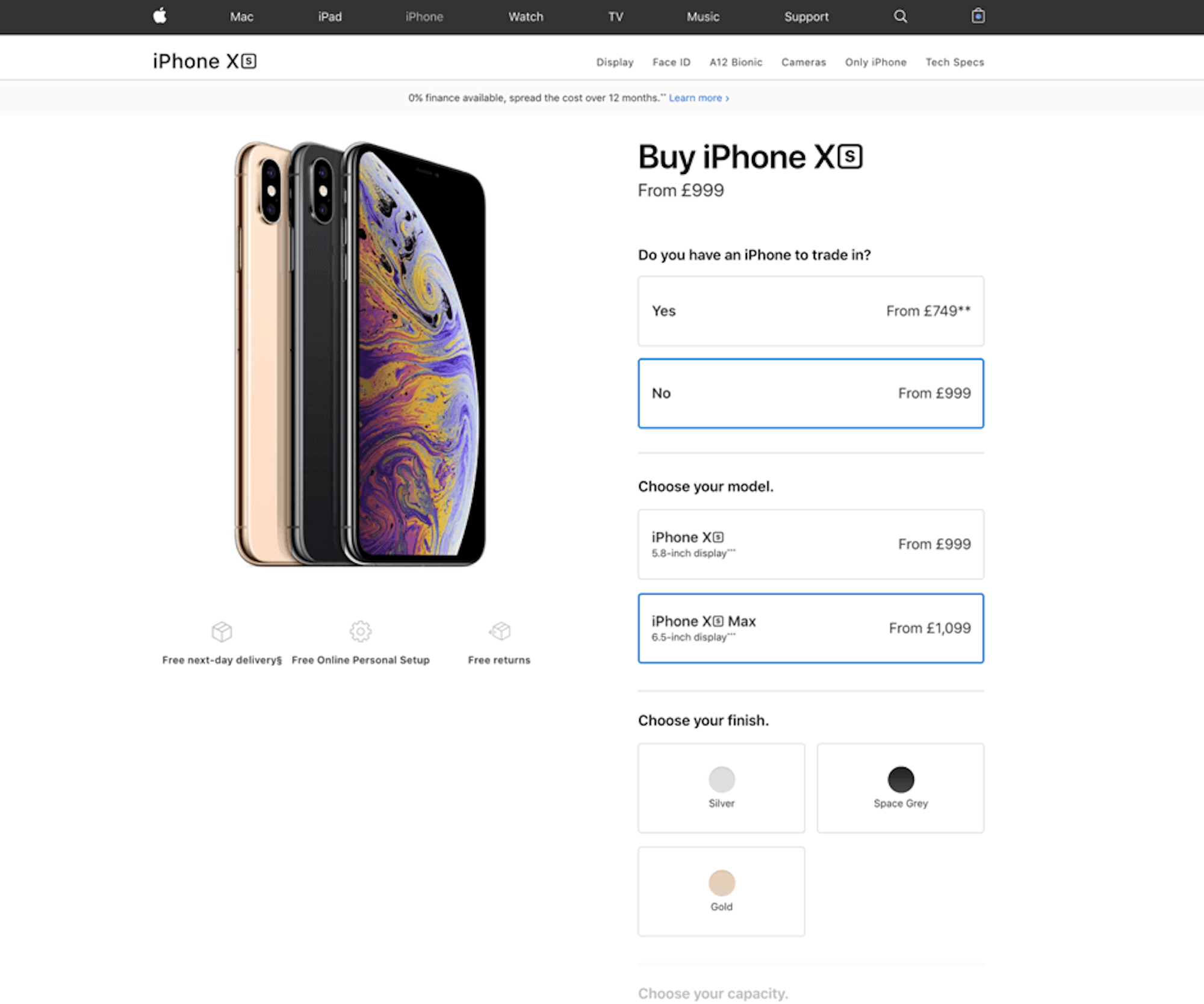
The majority of products being sold online are available in different sizes, colours and specifications/styles. Think of the iPhone for example. Make sure shoppers can easily switch between options. Being able to quickly swap between product options creates a smooth user experience with no interruptions.

4. Breadcrumbs
What are breadcrumbs?
Breadcrumbs are a set of links that are displayed in a small text path, usually above a product, to show where you are within the sitemap of a website and allows for an alternative navigation.

Breadcrumbs can also appear in Google search results by adding structured data to your site. What’s the purpose of this you ask? It gives users a clear understanding of where the page sits in your sitemap.

Different types of breadcrumbs
- Hierarchy based breadcrumbs - Hierarchy based breadcrumbs are the most common. These breadcrumbs tell you where you are located within a site, showing how many steps in you are from the homepage. For example, Home > Services > Web Design.
- Attribute based breadcrumbs - This breadcrumb trail is made up of product attributes. Mainly used on e-commerce sites. For example, Home > Product Category > Product > Gender > Colour > Size.
- History based breadcrumbs - As you’ve probably gathered by the name, these breadcrumbs display in order of what you have been doing on the site. So, something like, Home > Previous page > Current page.
Why does displaying breadcrumbs help with conversions?
User experience.
Nobody likes feeling lost. How often do you find yourself looking around for recognisable buildings or roads when you appear to be lost? The same goes for websites. With breadcrumbs, if a visitor becomes lost or clicked on the wrong product, it gives them the opportunity to quickly get back to the page they were on before. This reduces frustration and creates a better user experience (UX).
5. Images
I’m sure you are aware that for an e-commerce site, images of the products you are selling are 100% needed. Without them, how will your customers know what they are buying?
Just uploading an image and thinking “that’ll do” isn’t enough though.
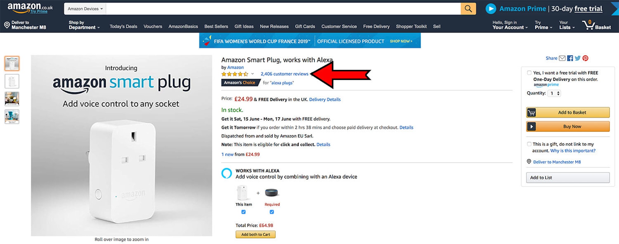
Your visitors want to see more than one image, in high-quality resolutions from various angles with the ability to zoom in. Provide this experience for your visitors and you’ll see more conversions. We promise.
6. Ratings/Reviews
The power of ratings and reviews has been proven many times. 84% of people trust online reviews as much as friends and 85% of online consumers read reviews before making a purchase. Include ratings and reviews on your product pages to help convince shoppers that they should buy from you.
Like most business, you’ll probably receive the occasional bad review. But don’t worry, you can turn this into a positive simply with how you respond. Be sympathetic, acknowledge the customer’s concerns, explain what your customers usually experience and provide contact information of someone that can discuss the problem further.

7. Related Products
If a product isn’t right for your shopper, you need to try and keep them engaged with something else (keeping them on your site for as long as possible). A great way to do this is presenting related products or “you might also like” products.
Recently viewed items is something you can include as well. It gives shoppers an easy route back to a product that they might have been umming and erring about. Giving your visitors the ability to browse related or recently viewed products with just one click is a great way to keep them engaged with your site.
User engagement is important. If it's high, you’ll notice more return visits and higher conversion, simply because your site works.

8. Wishlist
Let’s face it, we’re all guilty of browsing products that we just aren’t ready to buy yet. Giving your users the ability to save a product to a wish list and come back to purchase it later gives you a much better chance of making the sale over your competitor. If they see a product they like, but aren’t in the position to purchase it yet, they can easily access it at a later date.
We’ve seen some websites take this idea a step further. By giving the option to add items with colour and size options to the list that are currently out of stock. Then, when the item becomes available, the customer receives a notification via email.
9. Prices
You need to display your pricing prominently. If a user can’t see the price of the product within a few seconds, they’ll most likely bounce. As humans, we’re conscious of pricing and so want to know how much something is and if we can afford it. If we can’t afford it, we won’t buy it – it’s simple.
That’s why it’s best to display the price clearly to let the users judge if they want to spend that amount.
How to display prices clearly:
- Use a large font size
- Use contrasting colours
- Place it carefully, usually near the “buy” button or title
10. Clear CTA
Make your “add to cart’ or “buy now” button stand out and people will click it. Make sure the contrast is good and the button won’t become lost in your design. If you’ve done everything else perfectly, but the CTA to begin the checkout process isn’t clear, you’ll see no improvements to your conversion rate.
Be careful with how you word this button as well, if it says “add to cart” make sure the product is added to cart with some form of visual to show it has been added and let them continue. If the button says “buy now” then this should take them to the checkout page.
Now that you have all of the ingredients required to make high converting product pages, put this into practice and you’ll see great results.
Don't have enough time to create high converting product pages? We do! Get in touch today, we'd love to talk.

