This is great news for the user, unfortunately, it doesn’t save a developer anytime in construction, in fact will lead to a longer process, the build will now incorporate an additional WordPress integration phase. This is why themes are used.
A theme provides all the building blocks of a website. Things like navigation, buttons, sliders, video blocks and a range of simple column options. These elements can be easily put together to form a functional site.

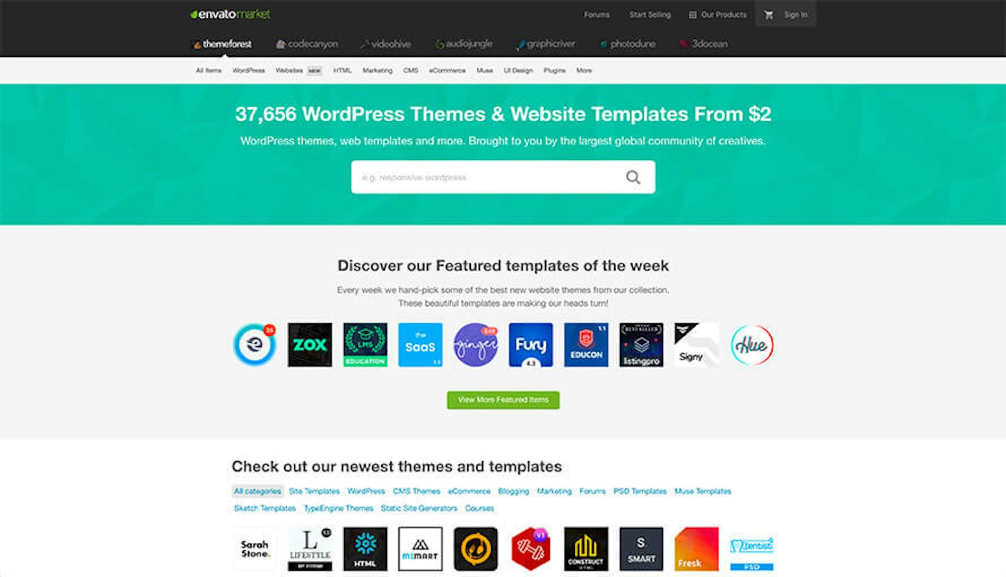
There are thousands of WordPress themes offering a variety of design styles and CMS functionality for different sectors. Although Themeforest is a great place to find huge number of quality themes, unfortunately there are thousands of poor quality themes out there to match! So how do you spot the difference? In short, there is no easy way. Things worth considering are:
- Number of sales
- Rating
- Comments
- Level of Documentation and support
The first three points are self-explanatory, but it’s the last point that is probably the most pertinent. Check before you commit to download what sort of documentation is available with the theme, does it give a breakdown of the features, does it give instructions on how to install and implement? – If the answer is no, it’s best to stay clear. With so many themes out there, it’s no surprise that there are going to be a few jokers in the pack.
Divi, my WordPress theme of choice
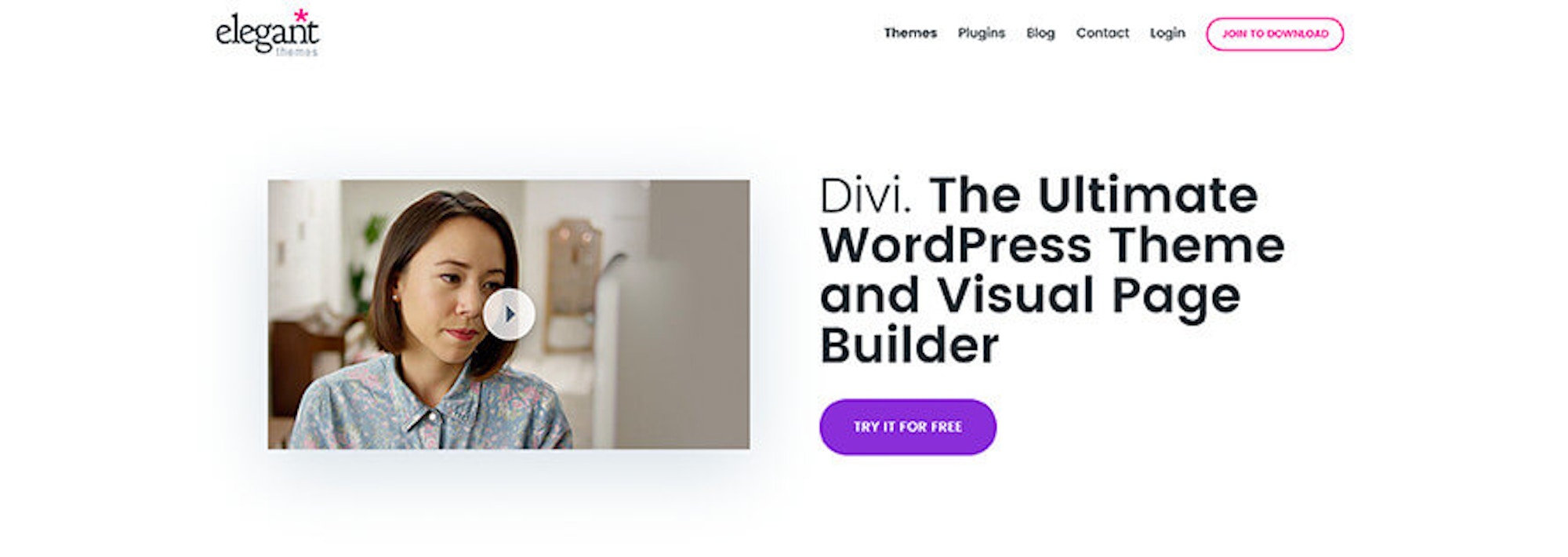
After experimenting with several popular themes, we’ve settled on using Divi from Elegant themes. This is a highly popular theme that’s hugely adaptable thanks to an excellent content building facility. In addition to this there is great support with a vast number of YouTube videos that run through every last feature.
Divi has a great range of section types so can handle almost any design problem. The builder is highly intuitive and can even be used visually enabling adjustments to be made directly to the webpage. It’s also setup nicely to handle a range of devices with easy-to-use responsive tools. It’s adaptability means it’s a possible to achieve a huge number of varied designs within this one theme.

Plugins to help with WordPress development
Whichever theme you choose it’s unlikely to come equipped with all the functionality required. After WordPress and the Divi theme has been installed we’re ready to make a few additions. A key feature of WordPress in the range of plugins available to extend utility of the platform. These are some of the plugins that we install:
- Simple Custom CSS & JS
A very basic plugin that allows the addition of custom CSS and Javascript all managed in one central locations - Duplicate Post
Plugins don’t get much more basic than this. Duplicate Post adds a ‘clone’ feature into the ‘Pages’ area - Compress JPEG & PNG images
We use TinyPNG on a daily basis to compress image files, this is their plugin that offers the same functionality directly within WordPress
WordPress design - take a step back
It’s tempting to get building and design on the fly with WordPress, but without a clear web design direction or vision the build will run round in circles which will ultimately hinder progress. Before we can get busy in Divi we need to establish a design plan. Here are a few points to consider:
- Have we a colour palette to work from?
- Do we know what fonts to use?
- Do we have access to photography?
- Is there a house style for illustration?
- Have we an idea of page layout?
Web Design Assets
If we are designing a site for a business that has a set of brand guidelines, then the first two points here should be easily resolved. On the other hand, if there are no guidelines to work from then there’s more to do. It’s always a good idea to discuss what existing assets a client has, even if there is no formal brand pack, the client may still have some established design principles. When it comes to typography discuss whether some digital guides are required. Not all typefaces perform well in the digital sphere, so an alternative for digital applications is often a great bet. Whatever is decided make sure both you and the client are in agreement, making these types of changes later on in the build will only result in unnecessary headaches.
Most WordPress themes will allow you to choose from google fonts or have several ‘built in.’ With a bit of dev work, it is super easy for professionals to embed custom fonts in any WordPress theme.
Photography in web design
If a client has photography this can be extremely useful, if not, ask for a few ‘real’ photos to use alongside stock imagery as this will add an extra level of authority to the website. We’re not talking about expensive professional shots here, a mobile phone used with care can garner impressive results. Reassure a client that these images will add, and will not detract from the look and feel of the design. As designers, we can implement these images in all sorts of interesting ways but it’s not uncommon for the client to still feel that their business lacks the polish of the bigger boys, opting to hide behind stock imagery. Unfortunately, to many tech native potential customers, this type of imagery stands out like a sore thumb; It’s unlikely that you’re Hampshire based mechanic will look like they have just have stepped out of a Hollywood health spa! It’s much better to use photography more akin to that shared on social media, this casual and relaxed feel will definitely resonate more with your audience.
There are some WordPress plugins that help source photography but we prefer to manually search, refine and ultimately be in control of this important design element.
Illustrations
Custom illustration is a great way to add flair and personality to a design, but be aware this is time consuming work. Divi, as with many other themes, have icons built in which give a great result without reaching for the drawing board. At Bigger Picture we love to add custom illustrations to our designs and will happily establish a consistent style if one isn’t already in place!
We believe illustration and iconography is one of the biggest factors that can give your site a custom and memorable feel vs a forgettable, generic design that will not do your business justice. WordPress does not have to be generic and all to often people confuse a theme and a template. WordPress is not a template website builder.
Now we are clear on what assets we have to work and what we focus on, it’s time to get designing!
Wireframe
Wireframing doesn’t have to be complicated, a simple sketch can be surprisingly beneficially in providing a direction. Admittedly, this is not the first time we have designed for Divi, so wireframing is much more straight forward when a theme’s features as well as limitations are known. We start with the homepage design, then the rest of the site follows from there.
This is an example of a homepage wireframe:

This wireframe helps to visualise the user journey of the homepage, let’s look at each section individually:
- Simple header
The job of the homepage header is to set the tone of the entire website, much like the cover of a book. It is also the container for the value proposition and should also guide the user on seamless to the next step of their journey. This section should not avoid being overly fussy and shouldn’t contain to many links to different places. The more choice you give a user the more likely they are to choose none of them. - Services
This is where key services are established. By arranging services into a few groups the customer has a very good idea of the type of work on offer. These signposts are extremely clear into each area if the user wishes to explore more. - Quote Section
The quote sections task is to provide proof. Get a previous client to give you a favourable review to include here. This MUST be genuine, include the referees name, position and company to add cogency. A picture is a bonus. - Partners / Customers
This section builds upon the quote section to add more trust by attaching the company to known and trusted brands. - Get in touch
Convinced? Now you can contact us. This section does exactly what is says on the tin. Point the user towards the conversion goal, in this case that is the contact page. - Footer
Fall back areas. If a user has reached the bottom of the page but hasn’t chosen to click through to the contact page they are then in danger of leaving the site. So to negate this problem we present the user with something that maybe of interest to them which purpose isn’t as outwardly sales orientated. Blog posts and Whitepapers are a great bet here. In addition to being genially helpful to a visitor they demonstrate knowledge and authority. It is this authority is extremely powerful. It is also worth noting that these long form pieces really help in the Google rankings!
Building design in WordPress
Now we’ve got a wireframe it’s time to start building! This process is made really easy with the use of the Divi builder, the drag and drop interface in really intuitive. It takes time consuming front0end build out of the equation and allows web designers to jump in. Great for budget conscious businesses.

There a few techniques we’ve identified in making this process even smoother:
- Set up colour palettes
Controlling colour gets harder the more customisation you add, but starting out by setting some global colour options will take some of the frustration away. Here are some of the setting in the Divi theme to look out for:
![global colours]()
- Recycle sections
This is probably the biggest time saver available to any website builder. Many sections on a website can be reused with slight modifications, others can be copied wholesale. This may seem like laziness but is in fact good practice, consistency is your friend when it comes to forming a cohesive user experience. Finding a theme with this functionality is highly recommended; it will save you a lot of frustration in the long run. In this example the ‘Call to Action’ section at the bottom of the homepage is a great candidate, this section will make an appearance across many of the other pages. As we’ve already built out this section all we need to do is save it for future use like so:![section module]()
I haven’t chosen to select the ‘make global item’ check box in this case as I might want to change the text in this section to make the content more page specific.
There are occasions with this design where the exact same section is required across pages, this being the case for the footer section. This is really convenient for population but also incredibly handy for updating further down the line. Once the ‘make global item’ box has been ticket the section turns green. From now on, any update made to this section will be mirrored across all other instances of this section type wherever they are on the site.![global section]()
- Decide on button styles early on
They may be simple but It’s a key element that all websites can’t do without; the power of the button should not be underestimated. Buttons aren’t static, they respond to interaction, consequently more than one style that needs to be considered in their conception.
I was told in architecture school to always pay close attention to the material choices of door handles and handrails, the things you were likely to physically touch in your journey through a building. A cheap door handle would instantly convey shoddiness even if many other elements in the build were of high quality. Focusing efforts on these interaction touch points is known as haptic design. The exact same process can be translated into the digital world.
There will most likely be more than one button style for a website. A straightforward approach is to consider a primary and a secondary button style, the former more prominent than the later. In addition to this, both Primary and secondary buttons require a reverse colour state for use on dark backgrounds.
Once the buttons have been created save them a module type for easy entry at other points in the build. This is much more effective than building out the page and styling each button one at a time further down the line, which is not only time consuming but this manual process is also open to inconsistencies.
This is also a great place to add a little design flair. The CSS involved in creating a button is nice and straight forward so why not experiment and construct something unique. - Establish font styles
Typography forms the backbone of all design work at Bigger Picture. Type choice will form the personality of the website so make sure your chosen typeface performs in all the areas required. The Divi theme comes pre-packaged with a small range of Google fonts, which work well for achieving great results straight from the box. For body copy these work nicely, but many of these are so heavily used around the web that using a font such as Roboto for a headline isn’t going to cut the mustard when it comes to standing ahead of the competition.
![text module]()
Almost every editable text field has options to change the size dependant on screen width. There are 3 sizes to adjust, desktop is the default followed by tablet and mobile. This works swimmingly in the majority of cases but causes issues when type is set to larger sizes. It’s not uncommon for us to set headlines as large 120px on desktop devices - which is frankly huge. If the text has to hyphenate or starts to flow over too many lines, then the page will appear broken to users.
With webpages viewed at virtually any resolution imaginable, we need to ensure the format remains consistent at any screen width. This is when extra media queries can be introduced. For this header there are 5 different media queries give a consistent user experience:
Installing plugins round two - plugins for a live environment
At this stage, the design has been built, it’s performing well on all devices and we’re ready to go live. But before we push the button there are a few more things to put in place, these being search engine optimisation (SEO) and security. Being WordPress, hundreds of plugins that tackle these concerns, here are the ones that we like to use.
- Yoast SEO
Yoast is a tried and tested SEO plugin for WordPress with an enormous user base. It provides simple inputs for meta text on each page as well as giving feedback on the quality of copy on each page.![yoast]()
- W3 Total Cache
W3 Total Cache improves the user experience of your site by improving your server performance, caching every aspect of your site, reducing the download times and providing transparent content delivery network (CDN) integration. - WP Cerber
This professional grade WordPress security plugin. Protects from brute force attacks by limiting the number of login attempts through the login form, XML-RPC / REST API requests or using auth cookies. Cerber restricts access with the Black IP Access List and the White IP Access List. Tracks user and intruder activity with powerful notifications.![cerber]()
Summary
WordPress is not going to be the best option for everyone, it’s important to be aware of the limitations of the theme and platform from the outset. If you want your site to be truly innovative and stand head and shoulders above your competition, then WP is probably not the platform for you. Picking the right technology and designing from a blank canvas is something we are strong believers in when the budget exists.
On the other hand, if you require a professional looking site with a conventional structure WordPress could be a great way of getting a fantastic result. It’s worth noting, although a helpful tool, WP is not a silver bullet when it comes to building a website. User experience knowledge, Search engine optimisation, conversion optimisation and web design skills are also required to achieve a polished result. Illustration with carefully crafted customisations are just some of the ways Bigger Picture harness this simple platform to produce websites that can generate real leads for your business.
If you have any WordPress related questions or a project you’re thinking of, speak to us for free advice on the right platform for you.


