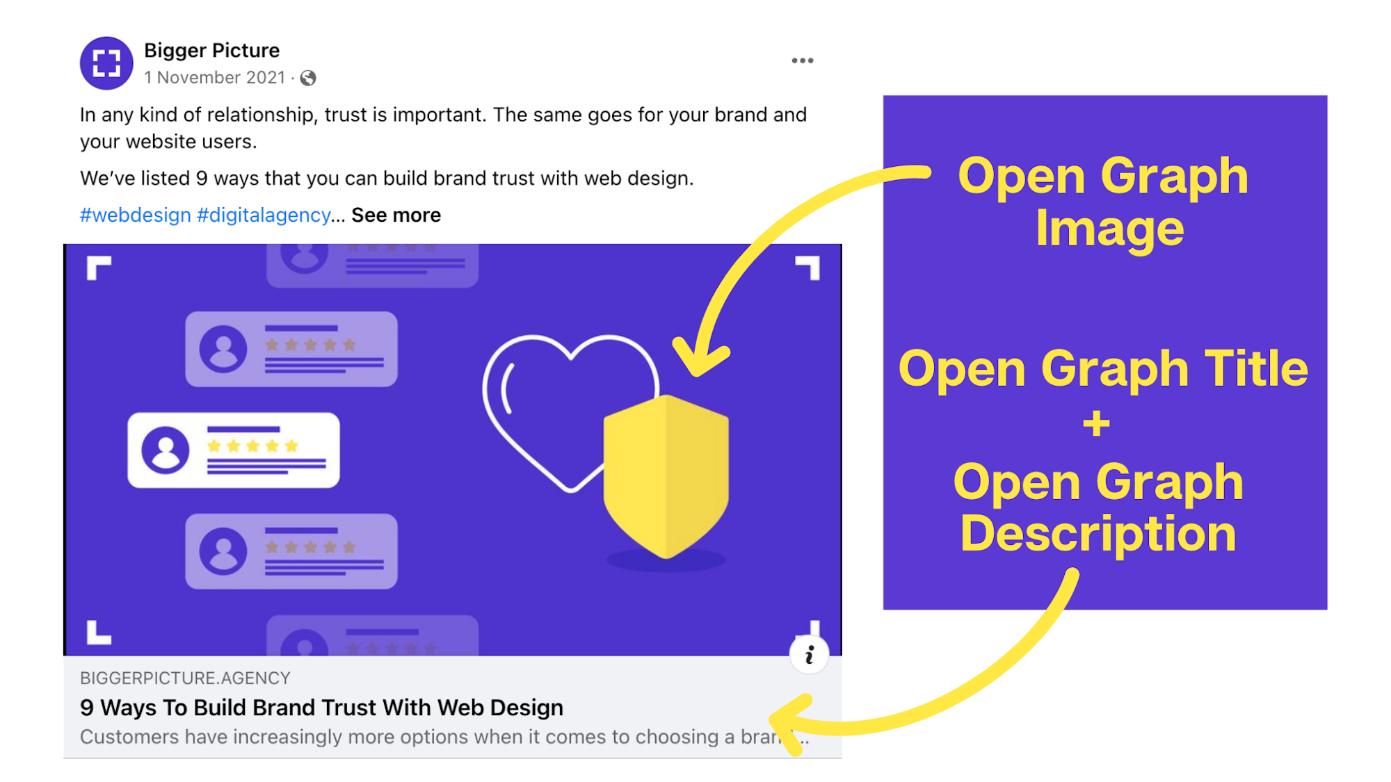
What is an Open Graph image?
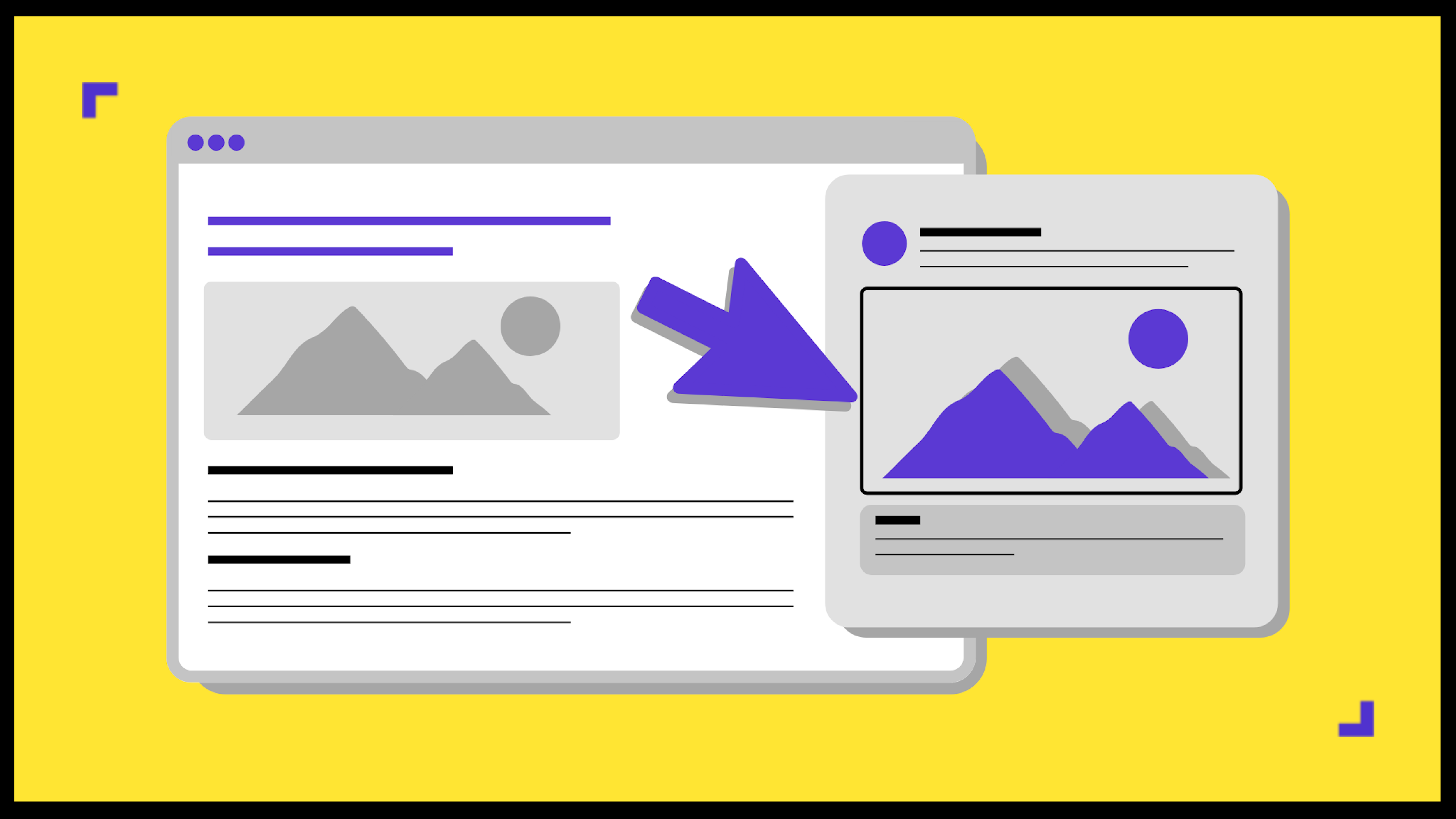
Have you ever shared a link on Facebook only to find that the thumbnail was missing, or there was a different picture to what you expected? Enter open graph images. An open graph image or ‘OG’ is an image that appears when website content such as blogs, are posted to a social platform. It is part of a fundamental group of meta tags that impact the performance of content links on social media sites such as Facebook, LinkedIn, and Twitter. Therefore, having optimised open graph images to accompany the meta title and description, will ultimately improve the social media traffic to a website.

How do Open Graph images help content links stand out??
- They grab the viewers’ attention
Creating an eye-catching open graph visual to accompany the tags, can help increase the chances of viewers clicking the content link and exploring the website. According to a recent survey, tweets with images receive 150 percent more retweets than tweets without images – proving the importance of visual assets when it comes to attracting engagement and leads.
- They drive brand awareness
Creating an open graph image featuring brand specific design elements such as the use of brand colours, or a logo, will increase brand awareness. Meaning, whenever anyone shares a link from a website to social media, the company's brand identity will be visible to whoever sees this post. The more users see a certain brand, the more likely they will be to remember it – and trust it.
- They tell people in brief, what the content is
As imagery is the first thing people’s eyes are drawn to before reading text, it is key to not rely solely on a catchy meta title to draw engagement in. Creating an interesting yet descriptive open graph image will give people enough of an overview of the content to hopefully entice them to click the link and find out more.
4 tips on how to get the most out of an Open Graph image
- Ensure it is the correct size
Before creating any open graph image, it is essential the image size is compatible with whichever platform it is being posted to. For example, Twitter can be problematic, due to the fact a regular 1200x630 pixel OG image doesn’t fit perfectly into a tweet, causing content to be cut off. CMS sites such as Webflow, have specific tools for creating perfect OG images and are free and easy to use. Alternatively, all the necessary information about image sizes can be found on each platform’s website, such as the Facebook Developers page. Sites such as Facebook and Twitter also have their own test facilities that allow a preview of the OG link to be reviewed before it is published.
- Create an eye-catching design
The design of an OG image is perhaps the most important part. Without a descriptive and interesting design, the image will not gain as much traction. For the best results, pick a suitable image or graphic asset that relates to the content, and accompany it with a piece of relevant and easy to read text such as a blog title or CTA that will draw readers in.
- Attach relevant accompanying tags
An OG will usually consist of a group of meta tags: a title, description, URL, image and type. Although these won’t have a direct effect on any on-page SEO, it will influence the performance of social link referrals. Together, if done correctly, these will have a positive impact on conversions and click-through rates.
- Show off the brand
Branding is important to include in any open graph image not only to drive brand awareness, but also to trademark the content as original. This can be done either in the use of a logo, or brand specific design elements such as colour or typography to signpost the content as being linked to a business. Especially if a post gains traction, it is important to ensure the branding associates a business to the post.
3 examples of an Open Graph image done right
Mailchimp
This is a great example of a successful open graph image. The image is eye-catching in its use of contrasting shades of red and cream colours, it displays a clear brand identity by using brand specific typeface, graphic illustrations, and logo, and it gives a brief overview of what the blog is about by featuring a bold title and descriptive illustration. This OG image doesn’t give too much away but instead draws eyes in, making viewers intrigued enough to read on.

Buffer
Another way to create a successful OG image is to try a graphic collage style like this image from buffer. This style is a subtle but effective way to draw eyes in - using large, bright imagery that relate to the content in the link will give just enough information to interest viewers but not too much that they will be put off. Buffer is a larger business with a well-recognised brand, so they have left out their branding, however, for smaller companies, it is always beneficial to include branding.

Hootsuite
Hootsuite takes a similar approach to buffer, using plain imagery without text. However, they drive brand awareness through their use of the brand specific colours in the imagery. This is a good way to create an OG image that drives brand awareness and discreetly hints at the content without giving too much away.

Open Graph images: Key takeaways
Open Graph Images are a simple addition to content links that can bring noticeable results for any marketing campaign. The appearance of content on social media can draw in more users and eventually conversions.
There are plenty of helpful tools available online, that can be used to create an eye-catching design, and generate code for OG images, that will make them stand out among the saturated social market. Alternatively, if you are sold on the use of Open Graph images but don't have the time, content or desire to create them yourself, why not reach out to our friendly content creation experts to help you get your social media rocking!
