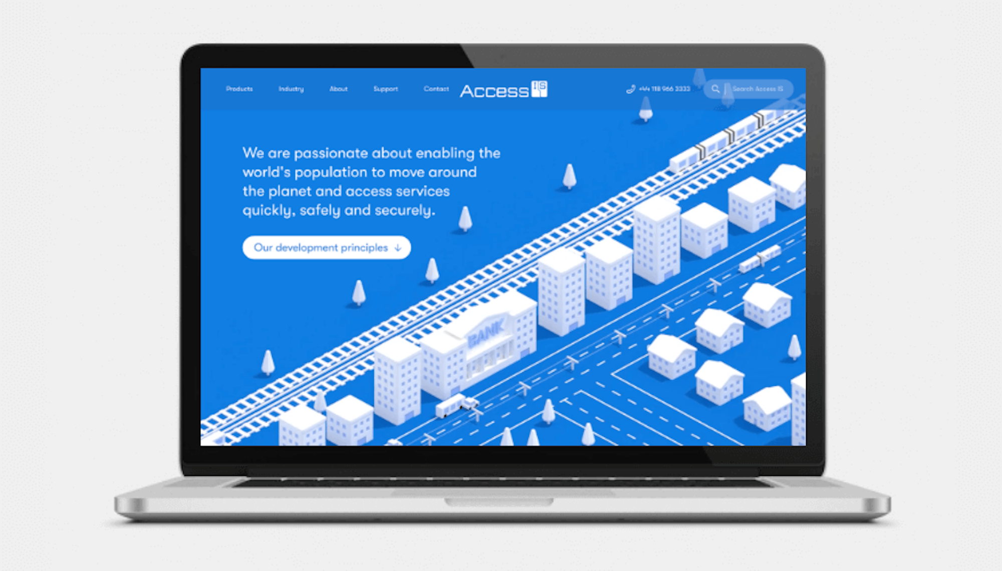
The success of your website is heavily determined by first impressions. According to one study, it takes just 50 milliseconds (that’s 0.05 seconds) for people to form an opinion about your website. That opinion determines whether they’ll stay and learn about your business or leave because you simply did not grab their attention from your opening proposition.
Here are the most common issues leading to a website redesign project.
1. The website design looks dated
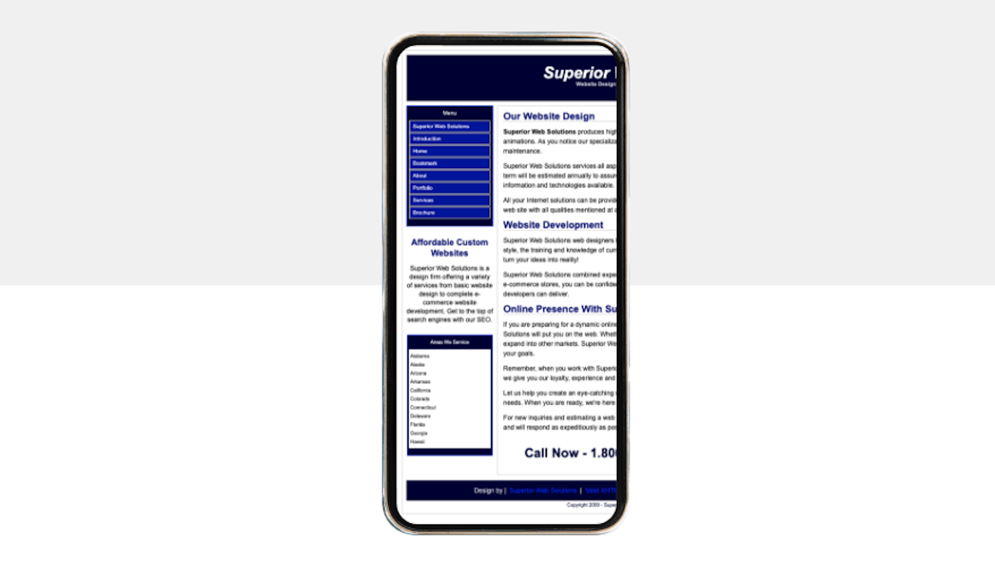
An outdated or unattractive web design can look unprofessional, leading to mistrust within your visitors. Forbes say that in a study titled Trust and Mistrust of Online Health Sites, participants were asked to search for relevant health information and determine which factors influenced trust of a given site over another. 94% of the factors were due to elements of web design. Wow!
What can we take away from this study? An attractive and modern looking site is a lot more likely to gain trust from people browsing the web. Why is trust so important you ask? People that have trust in your website are far more likely to buy your products, fill in that contact form or pick up the phone.
The biggest culprits of a dated website include:
- Websites with a narrow container leaving half the page empty
- Poor typography choices that come from the 90s
- Overused stock photography of smiley, suit wearing models
- Clunky paragraphs and basic templates that make it impossible to skim
How do you fix these issues for a more modern looking website I hear you ask?
Make use of modern screens, especially in the B2B world where mobile has not taken over. Current website development and design techniques means that we’re way less restricted and no longer forced to use fixed, narrow containers. Using the full width of screen allows us to be more creative in optimising your content for great engagement.
Spending a little money on a license to use a font that represents your brand, is easy to read, and stands out from the crowd is a super-effective way of making a great first impression. Changing the font on your website will have a much bigger impact than you may first think so don’t be afraid to experiment and trust your design team.
Simply say no to overused stock photography. No photo is better than one that blends in with a million other sites. Use bespoke illustrations, invest in real photos and be selective when a stock photo is the only option.
Nobody will read a ten-thousand-word paragraph. With the rise in social media, the average attention span of a human is 6-8 seconds. That’s not long at all. Making your content easy to skim by creating smaller paragraphs broken up with headlines, bullets, images, video and anything else that is relevant. The only time you should see paragraph after paragraph is on an informative piece of content, like this article ?

2. Your site doesn’t respond to mobile
Responsive design relates to how a website reacts based on several factors, the most prominent being screen size. When people land on your site from mobile, are they introduced with a zoomed out, hard to read, miniature version of your site? And what about laptop and tablet users? Responsive web design is certainly not something new but still too many people see it is a tick box exercise. The user experience you create on mobile and tablet may just make or brake your business.
A good responsive website design will cater to screens of all sizes, by adapting padding, margins, font sizes and a lot more. This improves the chances of you site supplying a good user experience for mobile, laptop, tablet and desktop viewers.
According to Search Engine Watch 72% of consumers want mobile-friendly sites. If that isn’t enough to convince you, with Google’s mobile first indexing, your site is ranked on search engine results pages based on its mobile version. Mobile responsiveness and the user experience that goes with it shouldn’t be taken lightly.
You may want to consider
- A mobile-first approach if you’re a B2C brand
- Using technology like AMP (Accelerated Mobile Pages)
- Generally designing with mobile and touch in mind

3. Your competitor’s websites are leading the way in design
Take a note of your 3 main competitors and visit their websites. Where does your current site sit compared to theirs? Look at it from a customer’s point of view and decide based solely on what you see. Which website do you feel more likely to give your personal information or even money to? If your site isn’t the winner, then perhaps you should consider a new design.
Ensure you know your customer and design for them. It doesn’t matter what your likes or dislikes are when you have objectives to meet. Before our creative team start designing a project we also look at the global leader in the given sector as well as other sites/brands that target the same customer demographic.
Always aim to be sector leading when it comes to web design. It’s a not a vanity thing but something that effects your bottom line. Good design sells for you and put simply, there is no excuse for bad design with the amount of inspiration and resource out there. Pick the right web design and digital strategy team and trust what they have to say.

4. Your branding is outdated or inconsistent
There is no denying traditional branding is still super important in the digital age. Your logo and branding material should have a much longer shelf life than a digital product however it is important it evolves with your business. As it evolves it’s all too easy to have old versions floating around in your digital footprint. Inconsistent branding can be as damaging as dated branding will only put question marks in your potential customers head. Keep it fresh, keep it consistent and don’t be afraid to update your wider guidelines to suit what you’re working on. A strong brand is one that easily adapts and grows.
If you’re thinking of a rebrand we suggest you look a print vs digital, system fonts vs licensed and don’t get suckered in to guidelines that are inflexible for other design teams to work with.

5. Your KPIs are taking a hit
The aim of most websites is to help generate leads or direct sales. If you are seeing a decrease in any of your key performance indicators, it might be a sign that you need a new website design and digital strategy. Some KPI red flags include:
- Higher bounce rate
- Lower pages viewed per session
- Drops in conversions
- Decrease in traffic
Google Analytics is a great tool for tracking your KPIs along with Search Console at the most basic level. Analysing data and spotting areas of weakness should be a task that is done constantly. If your data suggests there is more wrong than right, starting from a blank canvas might be the best way to go. The right digital agency and design team will create a website with your KPIs and objectives in mind and continue to measure and improve.

Don’t be afraid
Starting a new website design project can be just as daunting as it is exciting. Agencies like us will share all risks attached to a new website and everything involved in the migration. You won’t be in it by yourself. When you do decide to invest in a new website, collaborate, draw on expertise and be bold. Be remembered for creating the best digital experience your sector has to offer.

