

Before we begin…
These top 5 conversion rate optimisation considerations are meant to help you think when planning your new website. We are concentrating on web design here, one of several CRO components. You need to trust the web design agency you have appointed to look after and guide you through website performance when it comes to the technical development and more intricate components of CRO.
So here it goes, our top 5 CRO web design considerations!
- Social Proof
- Form optimisation
- Calls To Action (CTAs)
- Navigation and structure
- About Us page(s)
Social Proof
It is your job to convince a prospect to take the next step and either contact you or make that purchase. There is no better way to do this than prove your services or products are highly rated by your customers.
Social proof can come in several forms such as:
- A logo carousel showing existing customer base
- Relevant case studies that dive into your solutions and their results
- Aggregate ratings of a product or service i.e. rated 4.8 out of 5 stars by 1,000 people.
- A testimonial carousel, showing short snippets of reviews people have left you

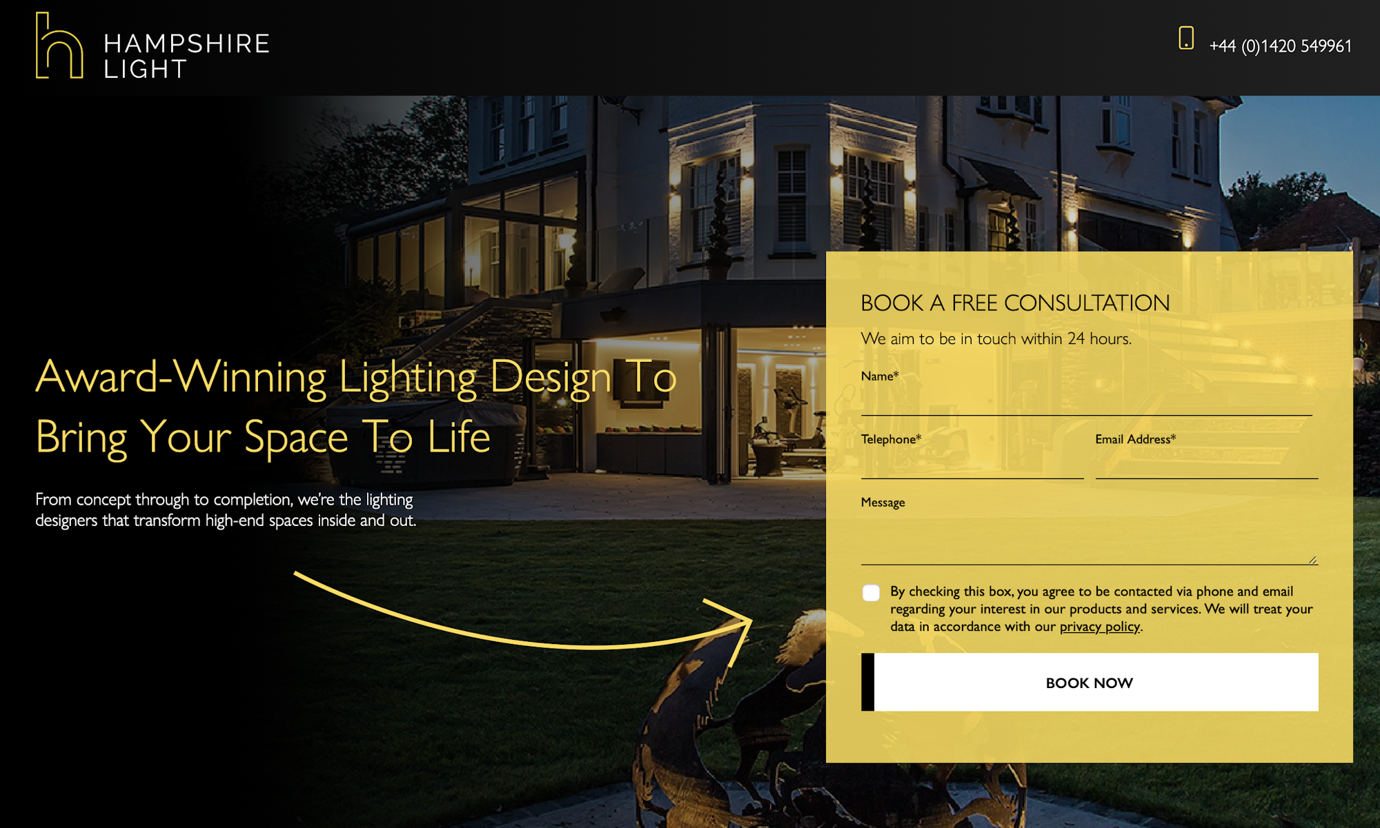
Form Optimisation
You’ve done the hard job and steered a prospect to a contact form. The final step is getting them to complete and submit that form!
Don’t get greedy and ask for a million bits of information. No matter how useful it is for you to follow up with the prospect in the best way, it is proven that 3 – 5 fields are optimal for many forms. Most forms have an average of 11 fields, creating a barrier for the user. Reduce their effort where at all possible to get as close to that magic 3 – 5 field number! That’s not all though, there are a few design techniques that also help with form optimisation:
- Contrast: Make sure your form stands out on the page it sits on i.e. if on a black background, try a white form.
- Submit button: CTA wording here is critical. Try A/B testing your submit button to create a sense of urgency i.e. Get A Free Quote Now instead of ‘Submit.’
- Real-time validation: it’s super frustrating when you can’t get a form to submit. Give your user clear error messages in real-time to remove frustration and increase your conversions
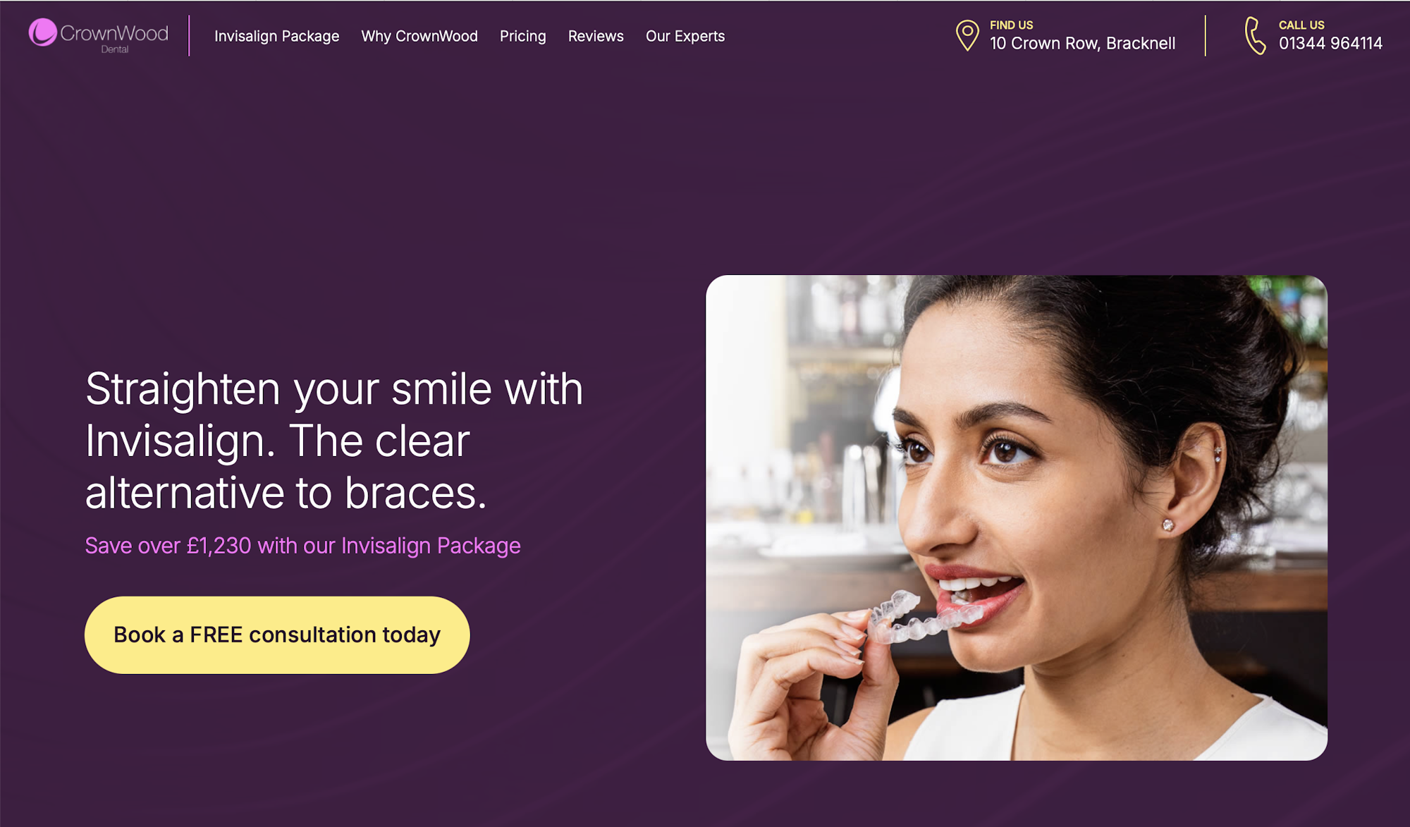
Calls To Action
CTAs or Calls to Action are key in enticing a prospect to take the next step. Like forms, contrast, wording and placement are key.
Things to avoid:
- Read more/find out more: It’s not descriptive and not enticing. You can do better!
- Use same anchor text: You should not use the same anchor text if your CTAs are pointing to different pages.
- Simple links: Don’t just link a couple of words in a paragraph, use buttons instead!
Things to try:
- Power words: Things like now, free, and limited time create a sense of urgency. A/B test your CTA wording and measure click through rates. You’ll be surprised!
- Button colours and styles: We’ve mentioned contrast, but experimenting with button styles, colours and size can make a key difference.
- Be descriptive: Bundle power words with strong verbs and intuitive, descriptive messaging such as Join For Free or Get A Free Quote Now
Navigation and Structure
Your navigation is critical to providing an intuitive user journey through your website. Avoid too many top level pages. Giving a user too many options makes it more likely they will take none and instead exit without taking action. Your navigation should be clearly labelled and descriptive. Our top tips include:
- Avoid more than 5-7 top level pages in your navigation structure
- Create a CTA in your menu to highlight a key page like contact or feature product
- Make your contact details easily accessible
- Use breadcrumbs on pages so users can easily navigate back and continue their journey
- When using mega-menus, make sure they are easy to skim on desktop and mobile to avoid clutter and visual fatigue.
About Us Pages
Perhaps the least obvious CRO web design consideration, but important, nevertheless. Our own analysis shows About Us pages are a key area in a prospects journey to converting. Don’t fall into the trap we see often where brands use their about us pages to highlight services and products. Prospects want to know your mission, vision, and the people behind the brand they are potentially reaching out to. Some tips include:
- Show your people: Don’t be put off by the number of staff you have vs your competition. At the minimum, show your senior and client facing team so prospects can see who they’ll be dealing with.
- Focus on the ‘why’: Prospects are interested in why you do what you do. Share your vision and mission with prospects so they know what you are about.
- History: Been around for a while? Showing where you came from and where you are today is a great way of building trust.

Need some help with your CRO efforts?
Bigger Picture take CRO seriously. We’ve been delivering CRO services for 20 years and have an in-house team of experts who know how to squeeze every bit of potential out of your website design.