Current Web Design Trends
Blobs in web design
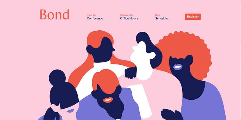
The most noticeable trend of 2018 is the rise of blobs (I know, a very technical term!). This trend came out of no-where and took over the web design community. If you go onto dribble, no doubt there will be at least one blob design on the home page.
I’m not really sure what the source of this trend was but designers are using this trend as a way of filling white space. I like how it allows a web designer to draw attention to a particular element however many designers seem to be chucking it on a page as it looks good.
Illustrations in Web Design
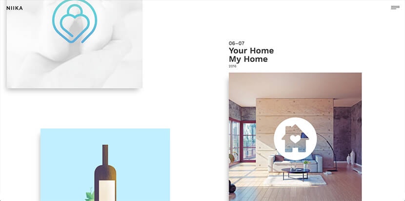
While on the topic of blobs, illustrators seem to have taken inspiration from the trend and implemented the style into illustration. By doing this, they have created a way to use detailed illustrations as the layout of a webpage itself. I personally love this style and feel it's very effective in drawing attention to key sections of a website.
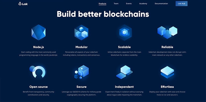
Another illustration trend consists of using gradients and opacity to create depth and vibrance within a flat design. A good website to look at when talking about this is Webflow, they have used opacity and gradients to great effect. The illustrators have been able to exploit this style to give the effect of luminosity throughout the site.
However, not everybody likes to use opacity so aggressively. There are many illustrators out there who enjoy taking advantage of the power gradients - and they can make them look fantastic too. This style may have been around for a while now but there is no sign of it disappearing any time soon.
Colour in Web Design
Colour is a big factor is web design, most designers take the time to really think about what colours should be used on a project to compliment a brand when brand guidelines allow.
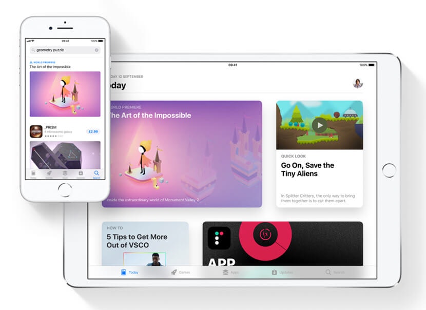
You may have seen last year gradients returned to us - many designers started to revive the style throughout their designs, even the likes of Apple took inspiration from gradients and included styles in their IOS11 update.
These gradients still seem to be an ongoing trend in 2018, but as brutalist design is becoming more popular, many designers are turning from these gradients and trying non traditional colour palettes and minimal styling.
Interactions in Web Design
Interactions are nothing new to web design - in fact it’s now become a crucial part of the design process. Interactions are usually anything from a simple hover effect, to full 3D interactive environments. However, it’s how designers and creative developers are pushing the limits of interactions that is impressive.
The main trend I’m seeing around is custom cursors, almost all the winning sites on Awwwards are utilising the power they allow, from simple non functional circles to fluid blobs that take the shape of its children - designers are definitely jumping at the chance to become more creative with the way people interact around a website.
Upcoming Trends in Web Design
Bye bye to grids
A key part in web design, sticking to a grid is something that's always been a rule in order to make the creative design, developer friendly. However, due to browser updates and advances in CSS, designers and developers are now able to free themselves from the boundaries of grids and design as if it was for print.
One trend I feel we will see much more in the future is grid-less websites. There will be no more fixed containers throughout the website, and baselines will be different throughout elements.
Illustrations
Hand drawn illustrations have been on the rise for the past few years, many brands have taken this style as it's been known to give off a friendlier and more approachable feel. You know they say, if it's not broke, don't fix it. I think this trend will continue throughout 2018 and be the go to for many people. The style of illustration might change though (think realism vs flat), and with performance being so important, more SVG illustrations will probably be seen.
The more problem with SVG illustrations can be the simplicity and lack of support with things like gradients. For a long time designers have used 3D illustrations in web design - but they have just been rendered images placed within the site somewhere. Again, thanks to new technology, we now have the options to create 3D illustrations within a webpage, this allows these images to be interactive, making it more intuitive for users - brilliant for grabbing attention and gives off a VR/AR feel. Potential speed and clunky browser experiences excluded, this style is breaking through slowly but surely.

Colour
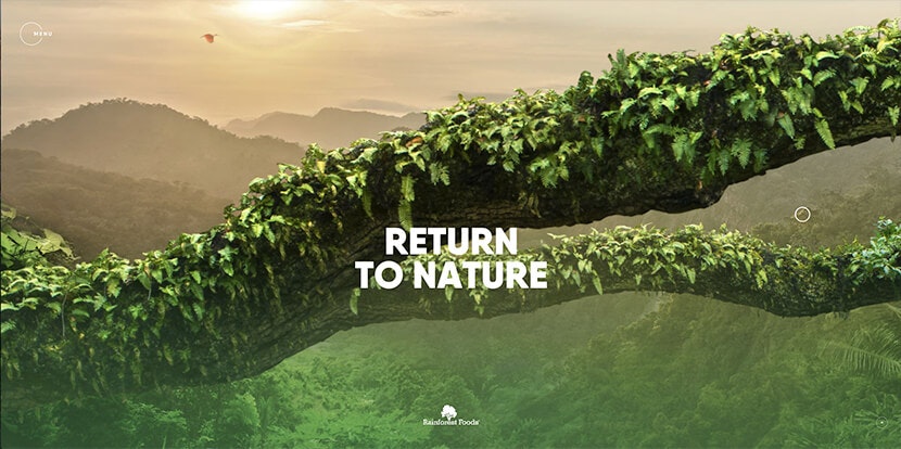
For a long time, the web has been very white. A trend I'm seeing more and more now is the use of dark websites. Not only are people designing to purposely be dark - many companies are also giving users the option to turn on a 'dark theme'. Many people prefer the use of dark colours as they are not as straining on the eyes to look at.
Will the popularity of dark websites take over that of lighter websites? Probably not, but I can definitely see this trend getting more popular in the near future.
Interactions
It's hard to predict what's going to be the next big thing for website interactions - it seems every day I'm finding new examples that are blowing me away, people are just moving so fast pushing the boundaries and creating new technologies.
One thing I would like to see in the future is a more engaging web. Yes, we have mouse and scroll effects - but I'm talking about a louder web. The web has always been so silent, and where it hasn't it's been overly loud annoying music. I would like to see designers using sound design to improve the experience users can have, while also using it to create more entertaining adventures.
Conclusion
A lot of design trends emerge to improve user experience and make the web a more engaging place, but I can't help but be slightly concerned with what i am seeing. A lot of sites with heavy interaction are browser killers and although they look cool, are they really designed for the user? The most exciting opportunity I see for web design agencies like us is the removal of traditional grids. it gives us an opportunity to make our bespoke websites stand out vs the countless WordPress themes and templates out there that do their best to keep up with the trends but are sure to struggle with the latest movements. It's an exciting time in web design and am prepared for bigger, bolder more interactive web experiences.

